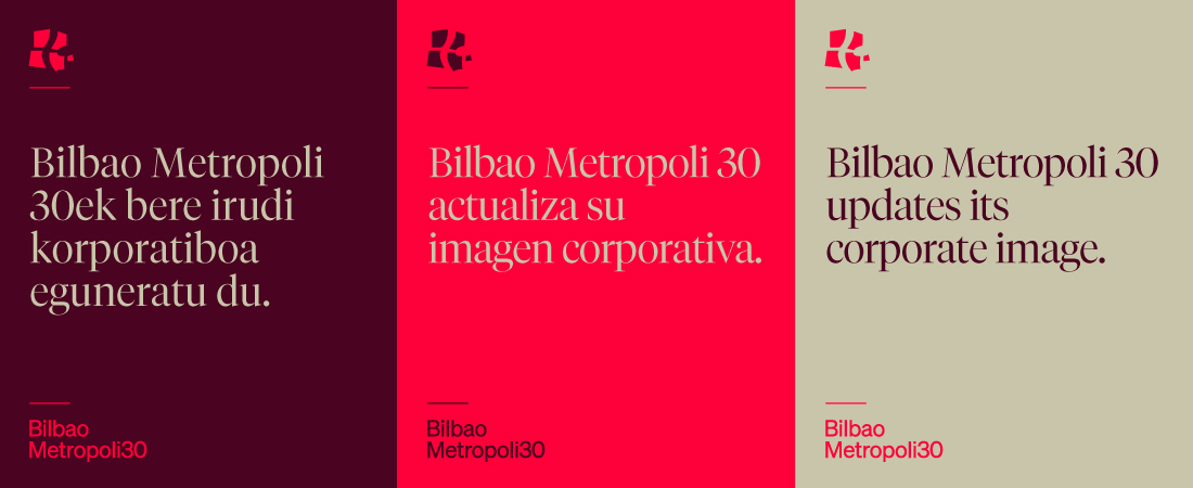
Bilbao Metropoli 30 updates its corporate image
Thus, we improve the resolution quality of our brand and its display in digital media, by incorporating a more modern typography, and using lowercase letters to convey and emphasize our proximity.
Furthermore, we keep the essence of our icon: the estuary, as the backbone of the metropolis and we remain faithful to the mission and values that originally shaped us.
The updating of our brand image is a reflection of our commitment to continuous adaptation, with a forward-looking vision. We evolve along with our metropolis.
We are metropolis.